Field types reference
Every field you can add to a form, what you can configure on it, what respondents see, and the settings shared by all fields — Required, Hidden, Key, Help Text, Split Row, Duplicate, Delete, and the canvas badges.
How to read this page
This page lists every single-question Field in the builder's palette, the settings each one offers in Field Details, and what a respondent sees. For the multi-field blocks at the top of the palette (Contact Information, Organization Information, Address, Property Information), see Field groups and reusable field sets. For how to add and arrange fields in the first place, see Build a form: fields, pages, and rules.
When you select a field on the canvas, Field Details opens in the left panel in this order: Label, Help Text, the settings specific to that field type, the Field Type switcher, the Required / Hidden toggles, a collapsible Scoring section, and a collapsible Advanced section. Everything below describes the middle part — the settings specific to each type. The shared parts are in Settings every field has.
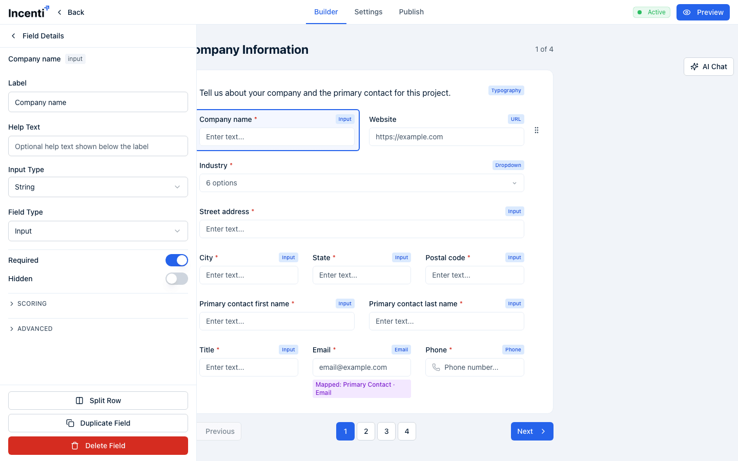
Input
The general-purpose one-line answer. Its Input Type dropdown decides how the answer is entered and formatted:
- Text — plain text, no formatting.
- Number — a numeric box that adds thousands separators as the respondent types.
- Currency — a numeric box with a currency symbol in front of it. Picking Currency reveals a searchable Currency picker ("Select currency...", "No currency found."). The help text under it reads "Defaults to USD when unset," so you only need to touch it for a non-dollar form.
- Percentage — a numeric box with a
%after it.
The badge in the top-right corner of the field's card on the canvas changes to match: Number, Currency, Email, or URL rather than the generic Input.
Textarea
A multi-line answer box. Label and Help Text are the only settings. Use it for narrative answers — project descriptions, justifications, anything longer than a line.
Dropdown
A pick-one (or pick-many) list. The Options editor holds one card per choice, each with:
- Value — what gets stored on the response and appears in exports.
- Name (Optional) — the display name shown to the respondent. Leave it empty and the respondent sees the Value.
Use the trash icon on a card to remove a choice and Add Option to add one. Turn on Multiselect (in the toggles below the Field Type switcher) to let respondents pick more than one.
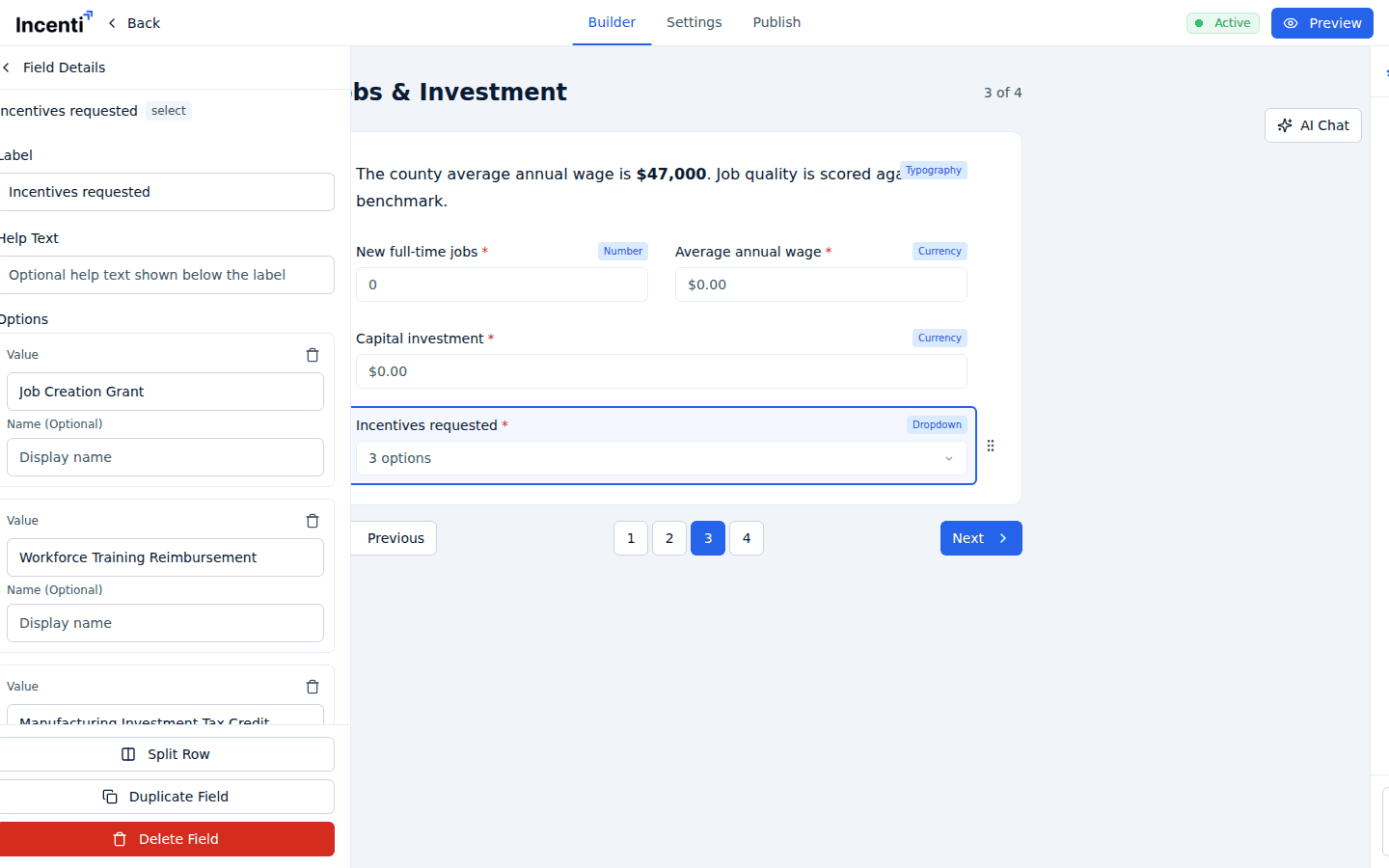
A Dropdown with no options renders as an empty list the respondent can't answer. Add at least one option before you publish.
Checkbox
Uses the same Options editor and Multiselect toggle as Dropdown, but renders as tick boxes rather than a list.
A Checkbox field with no options at all behaves differently: it becomes a single yes/no tick box with the field's label sitting beside it. That is the way to ask "I agree to the terms" or "Tick if this applies."
Phone
A telephone box with an international country picker, defaulting to the United States. Label and Help Text are the only settings. An entry that isn't a valid number is rejected with "You must provide a valid phone number."
An email box. There's no Input Type picker — the type is fixed. An entry that isn't an email address is rejected with "You must provide a valid email."
URL
A web-address box with a fixed https:// prefix shown in front of it, so
respondents only type the rest. An invalid entry is rejected with "You must
provide a valid URL."
Date
A date box that opens a calendar when clicked, with the placeholder "Pick a date". An invalid entry is rejected with "You must provide a valid date."
Typography
Static text — a heading, an introduction, a block of instructions. It is the one field type with no Label or Help Text; instead Field Details shows a Content editor with an inline preview ("Click to edit content...") and a maximize icon that opens the larger editor dialog. The content is Markdown, so headings, lists, links, and quotes all render.
Below it, a Style block sets:
- Alignment — Left, Center, or Right.
- Color — a hex value, for example
#000000. - Padding — separate Top, Right, Bottom, and Left values.
A Typography field is never required, never scored, and never triggers a rule — it asks nothing.
Signature
A typed signature, not a drawn one: the respondent types their name into a box that renders it in a cursive script. There is nothing to draw and no stylus or touchscreen needed.
Two toggles sit with Required and Hidden:
- Capture Date & Time — stores the moment the signature was typed.
- Show Date — shows that timestamp in a read-only box beside the signature.
Table
A grid the respondent fills in row by row. Field Details offers:
- Number of Rows — how many rows the respondent gets.
- Columns — a reorderable list. Drag a column by its handle, edit it with the pencil icon, remove it with the trash icon, or use Add Column.
The pencil opens the Edit Column dialog:
- Title — the column heading.
- Key — the column's internal identifier, which is what a formula references.
- Type — Text, Number, Currency, or Percentage (Currency adds its own Currency picker).
- Preset Values — a collapsible block with one box per row, so you can pre-fill a column (for example, a "Year" column reading 2026, 2027, 2028). With no rows set yet it reads "Set Number of Rows to add preset values."
- Required — the respondent must fill every cell in the column.
- Editable — turn it off for a read-only column the respondent can see but not change.
- Formula — turns the column into a calculated one. Switching it on forces Editable off and Required on, and opens a formula editor that can reference the table's other columns by their keys, so each row is computed from that row's own values. See Formulas and calculated fields.
A blank required cell is rejected with "You cannot leave the [column title] field blank."
Formula
A read-only answer computed from other answers on the form. Field Details gives you a Formula box with Insert field and Insert function buttons, live error messages, and an Output format of Number, Currency, or Percentage. The full syntax, function list, and troubleshooting are on Formulas and calculated fields.
Upload
A file attachment. There is nothing to configure beyond Label, Help Text, and Required — the field takes one file.
The respondent clicks Upload File, picks a file, and the upload starts straight away. Once it lands, the field shows the file type (for example PDF) and the file name with an X to remove it and choose another.
- Maximum size: 25 MB. A larger file is refused with "This file is too large. The maximum size is 25 MB."
- Accepted types: PDF, Word, Excel, PowerPoint, OpenDocument, text, CSV,
images, and compressed archives —
.jpg,.jpeg,.png,.gif,.bmp,.svg,.webp,.pdf,.doc,.docx,.xls,.xlsx,.ppt,.pptx,.txt,.csv,.odt,.ods,.odp,.zip,.7z,.rar,.tar,.gz,.tgz. Anything else is refused with "This file type isn't supported. Upload a PDF, Word, Excel, PowerPoint, OpenDocument, text, CSV, image, or compressed (zip, 7z, rar, tar, gz) file." - Two other messages can appear: "The upload service is busy right now. Please try again in a moment." and "Upload failed. Check your connection and try again."
Uploaded files are stored at links that work for anyone who has the link, with no sign-in. The links are long and unguessable and are never published, but don't treat an Upload field as a secure vault for highly sensitive documents.
Need more than one attachment? Add more Upload fields — one per document you expect.
Industries
A multi-select over your account's approved industry list, so respondents classify themselves consistently with the rest of your records. The placeholder reads "Select industries..." and an empty search shows "No industries found." If the list can't be loaded the field is disabled and reads "Options unavailable." Industries fields are not required by default.
Settings every field has
Label and Help Text
Label is the question a respondent reads; a required field gets an asterisk after it. Help Text is the optional line underneath.
Required and Hidden
Required means the respondent can't move past the page without answering. Hidden takes the field off the respondent's screen entirely.
A hidden field is never required, even when Required is also on. Hiding a field always removes it from validation — including a field a rule hides while someone is filling the form in.
Field Type
A dropdown that switches the field to another type, keeping its label, help text, and required setting. It's disabled for fields that belong to property pages, with a note explaining why ("This question is managed by the property pages." or "Field type is set by the property catalog.").
Key (under Advanced)
Expand Advanced to see Key, the field's internal identifier. It's editable and it's what formulas, exports, and the CSV column headings use.
Changing a Key breaks anything already pointing at the old one — formulas that reference it, and the column name in exports of responses already collected. Rename keys before you publish, not after.
Advanced also holds Auto Populate, which connects the field to your CRM. See Map fields to your CRM.
Split Row, Duplicate Field, Delete Field
At the bottom of Field Details:
- Split Row — pulls the field out onto its own line when it currently shares a line with another.
- Duplicate Field — adds a copy of the field, settings and all.
- Delete Field — removes it.
Split Row and Duplicate Field are hidden for fields on property pages. To put two questions side by side, drag one onto the other's row on the canvas; fields within a row can also be dragged left and right to reorder.
Canvas badges
A field's card on the canvas carries a type badge in the top-right corner (Input, Number, Currency, Email, URL, Dropdown, Table, and so on) and, underneath, up to three status badges:
- Scored — a scoring criterion on this form lists the field in its Connected Fields. See Form scoring criteria and AI scoring.
- Rule — a conditional rule uses the field as a trigger or a target. See Conditional rules.
- Mapped: entity · value — the field is connected to a CRM record. See Map fields to your CRM.
A hidden field shows a crossed-out eye icon beside its label.
Common questions
Q: How do I make a number field show a dollar sign? A: Add an Input field and set its Input Type to Currency. A Currency picker appears below it; leave it alone for US dollars, since it defaults to USD when unset.
Q: Do people draw their signature or type it? A: They type it. The Signature field is a text box that renders what they type in a cursive script — there's nothing to draw, so it works fine with a mouse or a phone keyboard.
Q: Can respondents upload more than one file in the same question? A: No. Each Upload field takes exactly one file. Add a separate Upload field for each document you need, and label each one so people know what belongs where.
Q: What file types can respondents attach and how big can they be? A: Up to 25 MB per file, and the accepted types are PDF, Word, Excel, PowerPoint, OpenDocument, text, CSV, images, and compressed archives (zip, 7z, rar, tar, gz). Anything else is refused with a message naming the supported types.
Q: What's the difference between Value and Name on a dropdown option? A: Value is what gets stored on the response and shows up in exports. Name (Optional) is what the respondent sees. Leave Name empty and they see the Value. Use Name when you want a readable label ("Fewer than 10 employees") over a tidy stored value ("under-10").
Q: How do I make a checkbox question allow more than one answer? A: Add your choices in the Options editor and turn on Multiselect. A Checkbox field with no options at all is a single yes/no tick box instead.
Q: Is a hidden field still required? A: No. Hidden always wins — a hidden field is excluded from validation even with Required switched on, and the same is true of a field that a conditional rule has hidden.
Q: Can I change a field's Key? A: Yes, under Advanced, but only do it before people start submitting. The Key is what formulas reference and what names the column in exports, so changing it afterwards breaks those references.
Related
Last updated on