Understand where dashboard KPI values come from
See what a KPI card is actually built from — a built-in account field, a custom tracked metric, or a calculation like a rate or ratio — and how each one is aggregated, scoped, and formatted.
Before you start
- Dashboards appears in the sidebar when your account's plan includes the Dashboards module. What that page shows depends on a second setting: the Dashboards 2.0 experience this page describes is turned on per account by Incenti and is off by default. If your Dashboards page opens a single embedded dashboard you can't edit, you're on the older experience — see Classic dashboards.
- This page explains where a dashboard's numbers come from and how they're calculated. For the click-by-click mechanics of adding a chart or managing a saved KPI, see Edit a dashboard.
- Every number on a dashboard — a Stat tile, a Progress bar, a bar/line/donut series, or a table column — is built the same way under the hood: a data source, one or more measures (an aggregation like Count or Sum), and optional filters. This page is about what feeds that measure.
What a KPI card shows
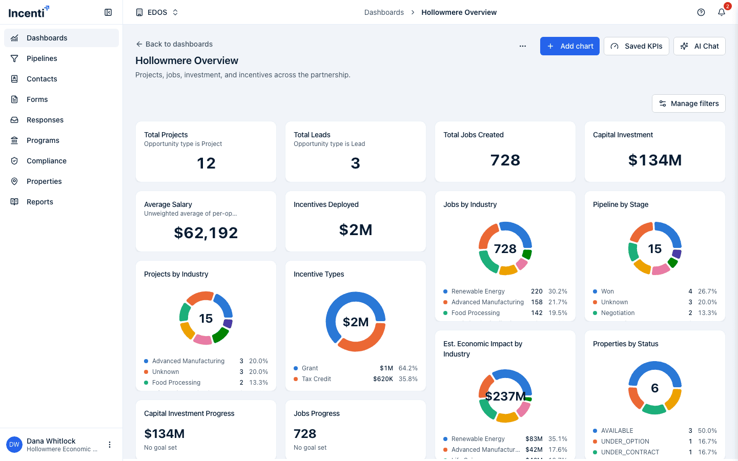
A KPI (Stat) card's single big number always comes from one of three things:
- A built-in account field — an aggregation over one of your account's own records (opportunities, contacts, properties, and so on), configured directly on the chart.
- A custom tracked metric — a value your account records per opportunity
through the account-level Metrics feature (see
Define custom metrics for opportunities),
charted through the dashboard's
metricdata source. - A calculation — a rate or ratio (like a win rate or cost per job) built from two other measures in the same chart, expressed as a divide, add, subtract, or multiply.
A chart can also reference a saved KPI: a named measure definition your account keeps once (in either of the first two shapes above, or as a calculation) and reuses across charts. Editing a saved KPI updates every chart that references it immediately. See Edit a dashboard for the Saved KPIs dialog itself.
Built-in metrics
Every chart's Data source picks which kind of record it counts or aggregates. Not every source has numeric fields to sum or average — some (Contact, Form) only support Count.
| Source | What it counts | Fields you can sum or average |
|---|---|---|
| Opportunity | Projects, leads, and RFIs in your pipeline | Total jobs, Total capital investment, Average salary, Estimated economic impact |
| Contact | People in your CRM | None — Count only |
| Form | Forms your account has created | None — Count only |
| Form response | Submissions of your forms | None — Count only |
| Property | Sites and buildings in your inventory | Available acres, Total acres, Sale price, Building square footage |
| Program | Incentive programs you administer | Total budget approved |
| Incentive | Individual incentives under your programs | Budget, Allocated amount |
| Incentive award | Awarded incentives tracked by Compliance | Amount awarded, Amount received |
| Task | Tasks on your opportunities | None — Count only |
| Metric (tracked) | Values recorded through the Metrics feature | Value (the tracked number itself) |
A source with no numeric field still charts perfectly well — you Count its records and group them by a dimension, such as Form responses by status or Tasks by priority. For every source's full set of group-by fields, filter fields, and dates, see Chart fields reference.
A dashboard chart can only pull from your own account's records — never another account's data or the Insights module's regional/geographic metrics.
Custom metrics
Custom metrics are the account-wide fields you define once on your account's Metrics tab (Jobs Created, Certified Sites Visited, Annual Payroll, and so on) and record per opportunity. A dashboard chart pulls those values in through the Metric data source rather than the opportunity source, and always has to be scoped to exactly one tracked metric before it can aggregate a value — either a filter on the metric's name/key, or a Group by on the metric's name/key. Counting recorded values (without aggregating the number itself) doesn't need that scoping.
A Metric-source chart also exposes which kind of record the value is tracked on (Project, Form Response, Contact, or Contact Group) and when the value was first recorded or last updated, so you can filter or group by those alongside the tracked value itself.
A value that isn't a plain number (for example a Text or Yes/No metric) can't be summed or averaged — it's excluded from the calculation rather than causing an error.
How values are calculated
- Aggregations — Count, Sum, Average, Min, or Max — run over every matching record after filters and any dashboard-level filter bar selections are applied. Count needs no field; the others need a numeric field to aggregate.
- Calculations — a rate or ratio, expressed as one of four operations (add, subtract, multiply, divide) over two measures already in the same chart. A win rate, for example, divides a count of won opportunities by a count of all opportunities. Dividing by zero, or a calculation missing one of its inputs, always shows an em dash (—) — never 0%, or a nonsensical number — an empty pipeline's win rate is genuinely unknown, not zero.
- Formatting — every value renders using the chart's configured Format (Number, Currency, or Percent), plus any decimal places, prefix, or suffix set on it. A Progress chart additionally compares the value to a Goal (or Budget) number and shows both the value and a percentage of that goal.
- Time windows — a chart's own Date range (a preset like last 30 days, last 12 months, or a custom from/to range) narrows which records count, same as any other filter. A dashboard's filter bar, when the dashboard has one configured, layers an additional selection on top.
The same sources, aggregations, and formatting rules apply to EDO and site selector accounts; only the records behind them differ.
Add or change a KPI
- To change what a single chart measures, open its ⋯ menu and choose Edit chart — you can change its data source, measures, filters, group by, and date range there. See Edit a dashboard.
- To create or edit a saved KPI so multiple charts can share one definition, click Saved KPIs above the grid. A saved KPI built as a calculation can only have its formula changed through the dashboard's AI chat — the manual dialog can still rename it or edit its description. See Edit a dashboard and Build a dashboard with AI.
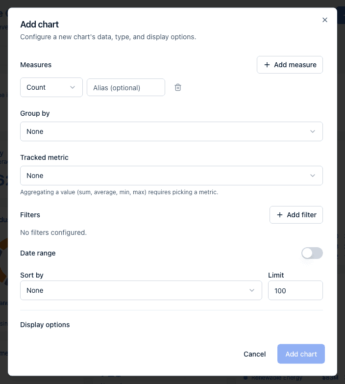
- To pin a chart or KPI to one custom tracked metric, use the Tracked metric picker that appears below Group by once you set the Data source to Metric. It reads "None" until you pick one, with the reminder "Aggregating a value (sum, average, min, max) requires picking a metric", and it fills in the required scoping filter for you instead of you typing a filter by hand.
What happens next
- Editing a chart's measure, filter, or data source updates that chart's number the next time the page loads — there's no separate publish step.
- Editing a saved KPI's definition updates every chart referencing it immediately, across every dashboard that uses it.
- A custom metric definition edited or deleted on the account's Metrics tab changes what any Metric-source chart shows the next time it loads, since the chart always reads the definition's current values rather than a snapshot.
Common questions
Q: My dashboard's Total Jobs doesn't match what I see in my pipeline — why? A: Check the chart's filters and date range first — a KPI scoped to "last 30 days" or to a specific pipeline stage only counts opportunities matching that scope, while your pipeline view may show everything. Also check whether a dashboard-level filter bar selection is narrowing every chart on the page, not just this one.
Q: My win-rate (or other percentage) KPI shows an em dash instead of a number — is that a bug? A: No — a dash means the calculation had nothing to divide, usually because the denominator (for example, total opportunities in the scoped time window) was zero. That's shown as undefined rather than as a misleading 0%.
Q: I created a custom metric under Account, but I can't chart it on my dashboard — what's missing? A: Set the chart's data source to Metric, then use the Tracked metric picker (or a filter/group-by on the metric's name or key) to scope it to that one definition — aggregating a Metric-source value without picking a specific metric isn't allowed, since summing unrelated values together would produce a meaningless number.
Q: Can I chart our programs' or incentives' budgets? A: Yes. The Program source can sum Total budget approved, and the Incentive source can sum Budget and Allocated amount — so a "budget allocated vs approved" Progress card is one chart, not two. For money actually paid out, use Incentive award, which has both Amount awarded and Amount received.
Q: Why can't I edit the formula on one of my saved KPIs? A: That KPI was built as a calculation (a rate or ratio) by the AI chat — the manual Saved KPIs dialog can rename it or edit its description, but the underlying formula can only be changed by asking the AI chat to adjust it.
Related
Last updated on