Edit a dashboard: layout, charts, and KPIs
Rename a dashboard, add and configure charts by hand, drag to reorder and resize tiles on the grid, and manage the saved KPIs your Stat charts can reference.
Before you start
- Dashboards appears in the sidebar when your account's plan includes the Dashboards module. What that page shows depends on a second setting: the Dashboards 2.0 experience this page describes is turned on per account by Incenti and is off by default. If your Dashboards page opens a single embedded dashboard with no Add chart button, you're on the older experience — see Classic dashboards.
- You need an existing dashboard — created from a template or built with AI. See Create a dashboard from a template or Build a dashboard with AI if you don't have one yet.
- Any user in the account can edit a dashboard — there's no admin-only restriction. Everyone with access to Dashboards can rename it, add or edit charts, reorder and resize tiles, and manage saved KPIs.
Steps
The dashboard page layout
Opening a dashboard shows a Back to dashboards link, its title and an optional description, a switcher to jump to your account's other dashboards (when you have more than one), a ⋯ menu with Delete dashboard, an Add chart button, a Saved KPIs button, and the dashboard's own AI chat. Below that is the chart grid itself. The AI chat is a separate assistant scoped to this one dashboard — see Build a dashboard with AI for what it can do; this page covers the manual, click-and-drag controls next to it.
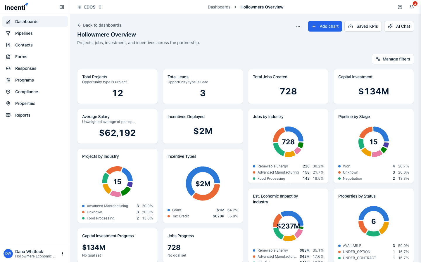
Rename or describe the dashboard
- Hover the title and click it, or click the pencil icon that appears next to it, to edit the title in place. Press Enter to save or Escape to cancel.
- Do the same with the description text just below the title — click it (or its pencil icon) to edit; if there's no description yet it reads "Add a description…" as a placeholder. Press Enter to save, use Shift+Enter for a line break, or press Escape to cancel.
- Both fields also save when you click away (blur) — you don't have to press Enter.
Add a chart manually
-
Click Add chart above the grid (or, on a brand-new dashboard with no charts yet, the Add chart button in the empty state).
-
In the Add chart dialog, set a Title, a Description (optional), and a Chart type: Bar, Donut, Stat, Progress, Line, Area, or Table.
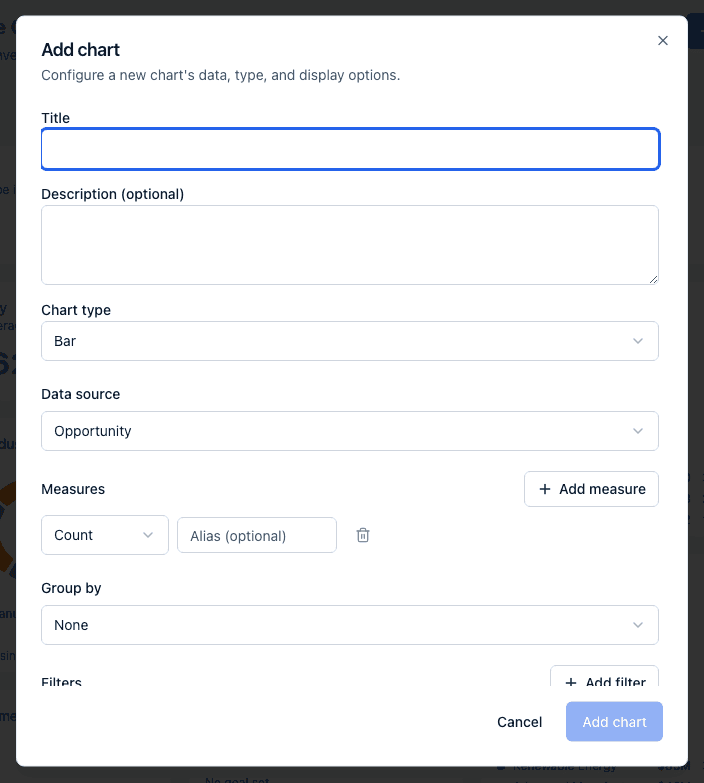
-
Choose a Data source. There are ten: Opportunity, Contact, Form, Form response, Property, Program, Incentive, Task, Incentive award, and Metric. Changing the source resets the measures, group by, filters, date range, and sort below it, since those are specific to the previous source's fields. For each source's fields, see Chart fields reference.
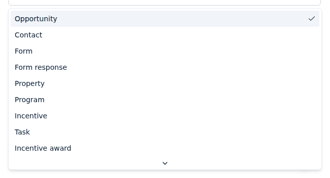
-
Add one or more Measures — an aggregation (Count, Sum, Average, Min, or Max) and, for anything but Count, a field to aggregate, plus an optional alias. Click Add measure for more than one.
-
Optionally set Group by to a dimension field. Choosing a date field adds a granularity dropdown next to it: Auto (the default, which lets the chart pick a sensible bucket), Day, Week, Month, Quarter, or Year.
-
Optionally add Filters — each is a field, an operator, and a value. See Filter operators and value pickers below.
-
Optionally turn on Date range. It has two controls: a Date field picker choosing which of the source's dates the range applies to, and the range itself — a preset (Last 30 days, Last 90 days, Year to date, Last 12 months, All time) or Custom range with your own from/to dates. The date-field picker's first option is Default (…), naming the field the source uses when you don't choose one. An Opportunity chart, for example, can be scoped by Start date, End date, or Created.
-
Optionally set Sort by (any group-by field or measure the query produces) plus Ascending or Descending, and a row Limit (1–1000, default 100).
-
Under Display options, set a number Format (None, Number, Currency, or Percent), Decimals (0 to 6), a Prefix/Suffix, and — for Stat and Progress charts — a Goal value and Goal label (None, Goal, or Budget). A Show legend toggle is also available.
-
Click Add chart. You'll see a "Chart added" message and the new tile appears on the grid.
Filter operators and value pickers
A filter row is a field, an operator, and a value. Eight operators exist; which ones the dropdown offers depends on the field you picked.
| Operator | Means | Offered for |
|---|---|---|
| is | exactly equals the value | every kind of field |
| is not | anything except the value | text, number, yes/no, list |
| is any of | matches any value in a list you give | text, number, list |
| greater than | above the value | number, date |
| greater than or equal to | at or above the value | number, date |
| less than | below the value | number, date |
| less than or equal to | at or below the value | number, date |
| contains | the text appears anywhere in the value | text |
The value box changes to match:
- A list field (one with a fixed set of values, such as Opportunity type or Status category) shows a dropdown of those exact values. With is any of, it becomes a Select values multi-select.
- A free-text field with is any of shows a Comma-separated values box — type the values separated by commas.
- A yes/no field shows a True / False dropdown.
- A number field shows a number box; a date field shows a date picker.
Opening Edit chart on a chart the AI chat built and clicking Save rebuilds the chart from what the dialog can show. Anything the dialog has no control for — a calculation such as a win rate, and per-measure filters that let one measure count a narrower set than another — is dropped. If a chart shows a rate or ratio, change it by asking the dashboard's AI chat rather than saving over it by hand.
Card states you may see on a chart
- "This chart couldn't load." — the query failed. A more specific message replaces it when there is one, for example a chart whose saved KPI was changed or deleted.
- "No data to display." — the query ran and matched no records. Widen the date range or check the chart's filters and the dashboard filter bar.
- "Unsupported chart type." — the chart's type is one this version can't draw; recreate the chart.
- "No goal set" — a Progress chart with no Goal value shows its number with this note instead of a bar. Set a Goal in Display options to get the bar and the percentage.
- Grey text under the title — when a chart has no description of its own, the card writes out what narrows it, for example "Status category is Active · Won/lost outcome is Won". It's generated from the chart's own filters so a headline number always says how it's defined. Typing a Description (optional) replaces it.
- "Unknown" — a bar, slice, or row for records where the grouped field is empty. It isn't clickable, because there's no value to drill into.
- "This dashboard has no charts yet" — the empty grid, with "Add a chart manually, or ask the dashboard assistant to build one."
Limits worth knowing
- A chart returns at most 1,000 rows, whatever you set Limit to. A chart that hits the cap prints "Showing the first 1,000 rows — refine the query to narrow results." under itself.
- A Donut chart draws at most 8 coloured slices and folds everything else into a single grey Other slice.
- Decimals accepts 0 to 6.
- A chart belongs to exactly one dashboard — two dashboards can't share the same chart. To reuse one, recreate it on the other dashboard (or ask that dashboard's AI chat for it). A saved KPI is the thing that is shared: several charts can reference one KPI definition.
Edit or remove a chart
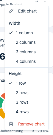
- Hover a chart's card to reveal its controls: a drag handle and a ⋯ menu in the top corner.
- Open the ⋯ menu and choose Edit chart to reopen the same configuration dialog described above, pre-filled with the chart's current settings. Change anything and click Save; you'll see a "Chart updated" message.
- The same menu's Width and Height sections let you pick an exact size (1–4 columns wide, 1–4 rows tall) without dragging — see below.
- Choose Remove chart to delete it from the dashboard. A Remove this chart? dialog names the chart and asks you to confirm with Remove; Cancel leaves it in place.
A chart built by the AI chat can reference a saved KPI as one of its measures. That measure shows up in the Edit chart dialog as a read-only "Saved KPI: …" row — you can remove it, but it isn't editable here. Edit the KPI itself instead (see below), or ask the AI chat to change the chart's measures.
Resize and reorder tiles on the grid
-
Drag to reorder: press and drag anywhere on a chart's blank card space (not on a button, menu, link, or table) to pick it up and drop it in a new position. Other tiles shift to make room as you drag.
-
Drag to resize: a small resize handle appears in the bottom-right corner of a card on hover. Drag it to change both width and height at once; the grid shows a dashed preview outline while you drag.
-
Resize from the menu: open a chart's ⋯ menu and pick an exact Width (1–4 columns) or Height (1–4 rows) instead of dragging.
-
Every reorder and resize saves automatically the moment you drop or choose a size — there's no separate Save step for layout changes.
-
On narrower screens the grid becomes a single column and every chart reads at natural height; resizing and reordering by dragging is still available on touch, and the keyboard (Tab to the drag handle, then arrow keys) also works for reordering.
Delete the dashboard
-
Open the ⋯ menu at the top of the dashboard and choose Delete dashboard.
-
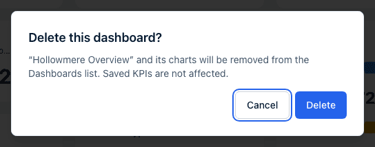
A Delete this dashboard? dialog names the dashboard and notes that its charts go with it while saved KPIs are not affected. Confirm with Delete or click Cancel.
-
You'll see a "Dashboard deleted" message and land back on the Dashboards list. To leave without deleting, use Back to dashboards at the top of the page or Dashboards in the sidebar.
KPI (Stat) cards and Manage KPIs
A Stat chart (shown as a KPI card on the grid) can pull its number from an inline measure you configure right there, or from a saved KPI — a named, reusable measure definition your account keeps once and can reference from any chart. Click Saved KPIs above the grid to open the management dialog.
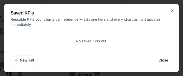
- The dialog lists every saved KPI with its name, a short summary of its definition, and how many charts reference it ("Referenced by 2 charts" or "Not referenced"). An account with none yet reads "No saved KPIs yet."
- Click New KPI to define one: a Name, optional Description, a Source, a Measure (aggregation and field), and optional Base filters — the same field controls as the chart dialog's Measures and Filters sections.
- Click Edit on an existing KPI to change its name, description, or definition the same way. A KPI whose formula was built by the AI chat as a calculation shows a note that its formula can only be edited through the AI chat — this dialog still lets you rename it.
- Click Delete to remove a KPI that no chart references. A Delete this KPI? dialog confirms, warning "This can't be undone." A KPI still in use shows a disabled Delete button with a tooltip explaining how many charts use it — repoint or remove those charts first.
- Editing a saved KPI updates every chart that references it immediately, without editing each chart individually.
- A saved KPI is a single measure over one source (plus optional base filters), or a calculation over plain numbers. A KPI can't be built out of another KPI.
See Metric definitions for more on how tracked metrics and calculated KPIs work.
What happens next
- Renaming the dashboard, editing its description, adding/editing/removing a chart, and every drag-to-reorder or resize all save immediately — there's no dashboard-level Save button anywhere on this page.
- None of these actions send a notification. You see the result — a moved tile, an updated chart, a renamed title — directly on the page.
- Deleting a saved KPI that's still referenced is blocked at the source; you can't accidentally break a chart by deleting the KPI it depends on.
- Deleting a dashboard removes it from the list for everyone in the account. Its saved KPIs stay available to other dashboards. There is no undo in the portal, so contact support if a dashboard was deleted by mistake.
Common questions
Q: I dragged a chart to a new spot but it snapped back — did my change save? A: If the drop didn't land on another chart's slot, nothing moves and there's nothing to save. If it did move and then reverted a moment later, the reorder failed to save — an error message appears and the grid refreshes to the last saved order; try again.
Q: Can I make a chart span the full width of the dashboard? A: Yes — resize it to 4 columns wide, either by dragging its bottom-right handle or by choosing "4 columns" from its ⋯ menu's Width section. That's the maximum width; the minimum is 1 column.
Q: I removed a chart by mistake. Can I get it back? A: Not from this page — once you confirm Remove, there's no undo menu. Recreate it with Add chart, or ask the dashboard's AI chat to add it back if you described it there originally.
Q: How do I get back to the list of dashboards? A: Click Back to dashboards at the top of the dashboard, or Dashboards in the sidebar.
Q: Why can't I edit the formula on one of my saved KPIs? A: That KPI was built as a calculation by the AI chat — the manual Saved KPIs dialog can still rename it or edit its description, but the underlying formula itself can only be changed by asking the AI chat.
Q: Why does the Edit chart dialog show my saved KPI measure as read-only? A: KPI references are managed centrally so every chart using them stays in sync — editing the KPI's definition in the Saved KPIs dialog is the only way to change what it calculates. You can still remove the reference from a chart, or add a different measure alongside it.
Q: Why did my win-rate chart lose its calculation after I clicked Save in Edit chart? A: The manual dialog rebuilds the chart from the controls it shows, and it has no control for a calculation or for per-measure filters, so saving drops them. Ask the dashboard's AI chat to rebuild the chart, and change rate and ratio charts through the chat from then on.
Q: What do "is any of" and "contains" do in a chart filter? A: is any of matches a record whose field equals any one of the values you list — pick them from the Select values multi-select, or type them comma-separated for a free-text field. contains matches when the text you typed appears anywhere inside the field's value, so "manufact" matches "Advanced Manufacturing".
Q: Can I filter a chart on the opportunity's start date instead of when it was created? A: Yes. Turn on Date range and set the Date field picker next to it to Start date. The picker lists every date the source offers — for Opportunity that's Start date, End date, and Created.
Q: Why does my bar chart say "Unknown" for one bar? A: Those are records where the field you grouped by is empty — no industry set, no pipeline stage, and so on. The bar isn't clickable because there's no value to drill into. Fill the field in on those records to move them into a named bar.
Q: What is the grey text under my KPI card's title? A: It's a plain-language summary of what narrows that chart, written automatically when the chart has no description — for example "Status category is Active". It's there so a headline number always shows how it's defined. Type your own Description (optional) to replace it.
Q: Why does my Progress card say "No goal set"? A: A Progress chart needs a Goal number to draw its bar. Open the chart's Edit chart dialog, set Goal under Display options (and Goal label to Goal or Budget), and save.
Q: Is there a limit on how many rows a Table chart shows? A: Yes — 1,000, even if you set Limit higher. A chart that hits the cap prints "Showing the first 1,000 rows — refine the query to narrow results." Narrow it with a filter or a date range instead.
Q: Can two dashboards share the same chart? A: No. Each chart belongs to one dashboard, so build a copy on the other dashboard (or ask its AI chat for the same chart). Saved KPIs are the shareable part — several charts across dashboards can reference one KPI, and editing it updates them all.
Related
Last updated on