Filter a dashboard and drill into a chart
Apply dashboard-wide filters, share a filtered view by its link, click into a chart to see the records behind a bar, slice, or KPI, and export those records to CSV.
Before you start
- Dashboards appears in the sidebar when your account's plan includes the Dashboards module. What that page shows depends on a second setting: the Dashboards 2.0 experience this page describes is turned on per account by Incenti and is off by default. If your Dashboards page opens a single embedded dashboard with no Manage filters button, you're on the older experience — see Classic dashboards.
- You need an existing dashboard. See Create a dashboard from a template or Build a dashboard with AI if you don't have one yet.
- A brand-new dashboard has no filters configured. Anyone with access to Dashboards can add filters — there's no admin-only restriction.
Steps
The filter bar
If a dashboard has no filters configured yet, the only control above its chart grid is a Manage filters button. Once at least one filter is configured, a filter bar appears with one control per configured filter, a Clear filters button (once any control has a value), and Manage filters at the far right.
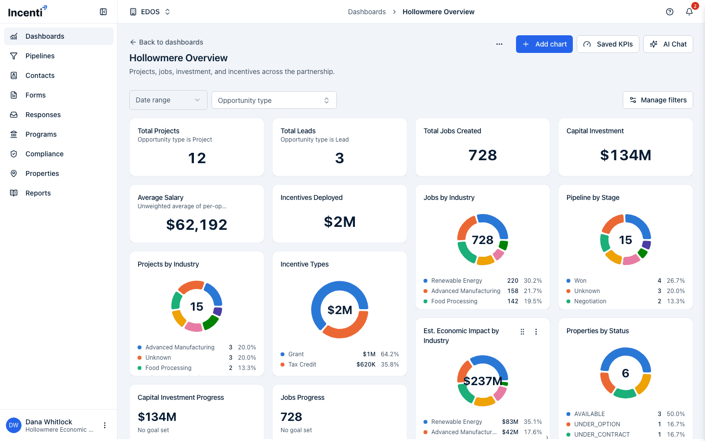
Three kinds of filter can appear on the bar:
- Date range — a preset (Last 30 days, Last 90 days, Year to date, Last 12 months, All time) or, from the same dropdown's Custom… option, an exact from/to range picked on a calendar.
- Field — a multi-select search box scoped to one data source and field (for example Opportunity → Industry). Its options are the distinct values seen in your account's data for that field, loaded the first time you open it.
- Account scope — a multi-select of your account and its child accounts, for scoping the dashboard down to specific ones. You can add this filter in Manage filters on any dashboard, but its control only shows on the bar when your account actually has child accounts to scope to; otherwise it stays hidden.
Changing any control immediately re-runs every chart on the dashboard with the new filter applied — there's no separate Apply button. Each control also carries its own Clear button naming that filter once it has a value, next to the Clear filters button that resets the whole bar.
Filter limits
- A dashboard can have at most 10 filters configured on it.
- One of them can be a Date range filter and one an Account scope filter; the rest are Field filters.
- A Field filter accepts at most 10 selected values at a time. To look at more than ten, filter the charts themselves instead (see Edit a dashboard).
- An Account scope filter accepts at most 50 accounts.
Add or remove filters with Manage filters
-
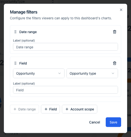
Click Manage filters to open the Manage filters dialog. It lists every filter currently configured for the dashboard, each with a drag handle to reorder it and a trash icon to remove it, plus an optional Label (optional) text field that renames the filter's control on the bar. Left blank, a Field filter's control shows the field's own name (for example "Opportunity type").
-
Click Date range, Field, or Account scope at the bottom to add one more filter. You can only have one Date range filter and one Account scope filter at a time — those buttons disable once one of each is added. You can add as many Field filters as you like.
-
For a Field filter, choose its Source (the data source the chart catalog offers, such as Opportunity or Form response) and then its Field — the field list updates to match the chosen source.
-
Drag a filter's grip handle to change the order its control appears in on the bar.
-
Click Save. You'll see a "Filters updated" message and the dialog closes; the filter bar immediately reflects the new configuration.
How filters affect every chart
A configured filter narrows every chart on the dashboard at once — there's no way to apply a filter to only some charts. A Field filter with values selected becomes an additional condition every chart's query is run with; a Date range filter scopes every chart's own date field to that range; an Account scope filter narrows the tenant scope every chart already queries within.
The filtered view is in the link
Your filter selections live entirely in the page's URL — nothing is saved to the dashboard itself when you change a control (only Manage filters persists changes, and that changes which filters exist, not their values). This means:
- Copying the URL while filters are applied and sending it to a teammate (or bookmarking it) reproduces the exact same filtered view when they open it — as long as they also have access to this dashboard.
- Reloading the page keeps your filter selections, since they're encoded in the URL you reloaded.
- Navigating away and back through Dashboards or the dashboard switcher drops the selections — you land back on the unfiltered view.
Drill into a chart
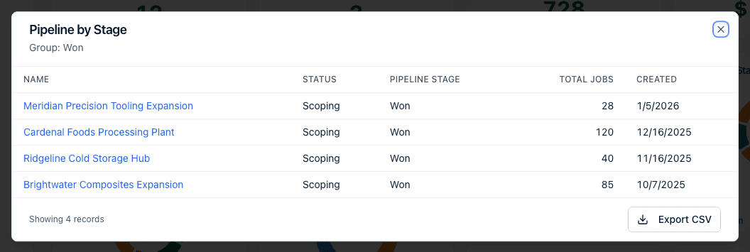
Click a bar, a donut slice or its matching legend row, a line or area data point, a Stat/Progress card, or a Table row to open a read-only dialog listing the records behind what you clicked.
- Bar, Donut, Line, Area — clicking a bar, slice, or point drills into that one group value (or, for a chart grouped by day/week/month/quarter/ year, that one time bucket).
- Stat, Progress — clicking the card drills into the chart's whole filtered set, since there's no group to narrow into.
- Table — clicking a row drills into that row's group value or time bucket, the same as a bar or slice.
- A folded "Other" slice on a Donut chart (used once a chart has more than 8 categories, the size of the colour palette) can't be drilled into — it represents many categories at once, not one.
The dialog's title names the chart; its subtitle names what you clicked, in one of three forms:
- "All records" — the chart's whole filtered set, from a Stat or Progress card or an ungrouped Table row.
- "Group: Won" — one category of a grouped chart, named by the value you clicked.
- "Bucket: 2026-03" — one time bucket of a chart grouped by date. The
bucket key is written the way the chart groups:
2026-03-14for a day or a week (the week's Monday),2026-03for a month,2026-Q1for a quarter,2026for a year. It stands for the whole bucket, not a single day.
The predicate behind the rows is always recomputed on the server from the chart's own saved configuration — you can't drill into anything the chart itself doesn't already query for.
What the drill-down table shows
Each source has its own fixed set of display columns — for example an Opportunity drill-down shows Name, Status, Pipeline stage, Total jobs, and Created date; a Form response drill-down shows the respondent, status, form, and submitted date.
The first column links to the record's own detail page when one exists. Opportunity, Contact, Form, Form response, and Program rows link to their record; an Incentive award row links to that award in Compliance. Property, Incentive, Task, and Metric rows have no detail page of their own, so those rows are read-only.
The footer shows how many rows are loaded and, if the chart declares a reconciling total, that total computed from the loaded rows. The dialog loads 100 records per page: a selection with more than that reads "Showing 100+ records" and offers a Load more button that adds the next 100. An "Open in [module]" button also appears when the clicked selection can be re-expressed as that module's own list-page filters (today this only happens for Form response charts, which open Open in Responses).
If nothing matches, the dialog reads "No records match this selection."
Export drill-down records to CSV
Click Export CSV in the drill-down dialog's footer to download every
record behind your selection as a CSV file — not just the rows currently
loaded in the dialog. The file is named <chart-title>-drilldown.csv, and
the export is capped at 10,000 rows; a selection with more than that is
truncated in the file.
What happens next
- Filter changes and drill-down clicks never write anything to the dashboard — they're read-only interactions. Nothing you do here can be undone because nothing is saved except through Manage filters.
- No notification is sent for any of this; you see the effect immediately on screen or in the downloaded file.
Common questions
Q: I filtered a dashboard and sent the link to a coworker, but they see
the unfiltered dashboard. Why?
A: Check that you copied the URL while the filter bar showed your selected
values (the URL should include a filters= part) rather than the plain
/dashboards/<id> link. Also confirm your coworker has access to that same
dashboard — the link only reproduces the filtered view for someone who can
already open it.
Q: I clicked a slice on a donut chart and nothing happened. A: You likely clicked the folded "Other" slice, which groups several smaller categories together and can't be drilled into. Click a named slice or its legend row instead.
Q: The drill-down dialog only shows some of the rows I expected. Is data missing? A: The dialog loads records a page at a time — click Load more at the bottom if it's shown. If you need every row at once, use Export CSV, which downloads the full set (up to 10,000 rows) regardless of how many pages you've loaded on screen.
Q: Can I apply a filter to just one chart instead of the whole dashboard? A: No — every filter configured on a dashboard applies to all of its charts. To see a different slice on just one chart, edit that chart's own filters instead (see Edit a dashboard: layout, charts, and KPIs).
Q: I added an Account scope filter but nothing new appeared on the filter bar. Why? A: The Account scope control only shows when your account has child accounts to scope to. If your account has none, the filter stays configured but hidden, and every chart already shows all of your account's data.
Q: Why can I only pick 10 values in a filter? A: A Field filter accepts at most 10 selected values, to keep every chart on the dashboard re-running quickly. If you need more, put the condition on the individual chart instead — a chart filter using is any of takes a longer list. See Edit a dashboard.
Q: How many filters can one dashboard have? A: Ten, of which at most one can be a Date range filter and at most one an Account scope filter. The Manage filters dialog disables those two buttons once you've added them.
Q: Why does the drill-down footer say "Showing 100+ records"? A: The dialog loads 100 records at a time, and the "+" means there are more behind them. Click Load more for the next 100, or Export CSV to download the whole selection (up to 10,000 rows) at once.
Q: The drill-down subtitle says "Bucket: 2026-Q1" instead of a date
range. What does that cover?
A: The whole bucket the chart grouped by — in that example, 1 January to
31 March 2026. A month bucket reads like 2026-03, a year like 2026,
and a day or week like 2026-03-14 (for a week, the Monday it starts on).
Q: Why can't I open the record behind a drill-down row? A: Property, Incentive, Task, and Metric records have no detail page of their own in the portal, so those rows are read-only. Incentive award rows do open — they link into Compliance.
Related
Last updated on